Choose A Design Style

Learn more about the different design styles for website design, logos, business cards, posters, flyers & more.

Choose-design-style-examples-min

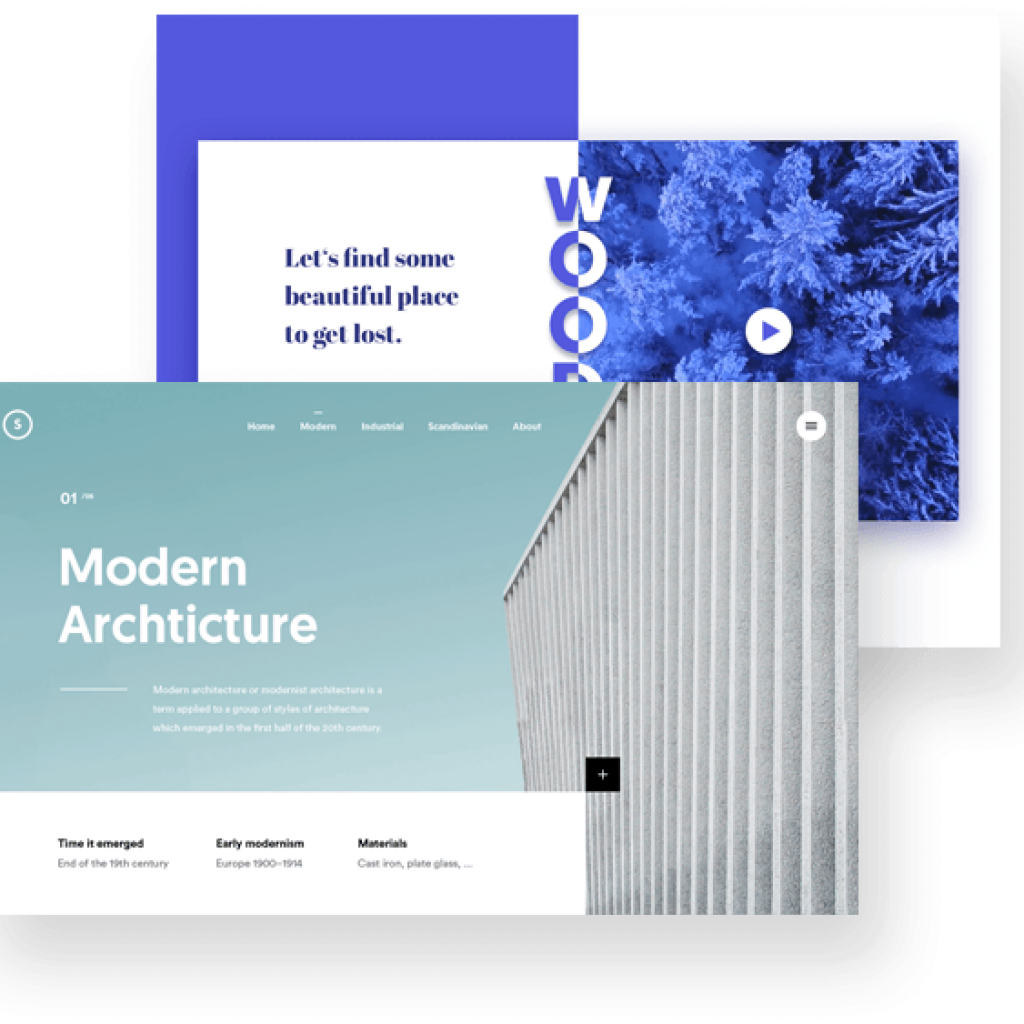
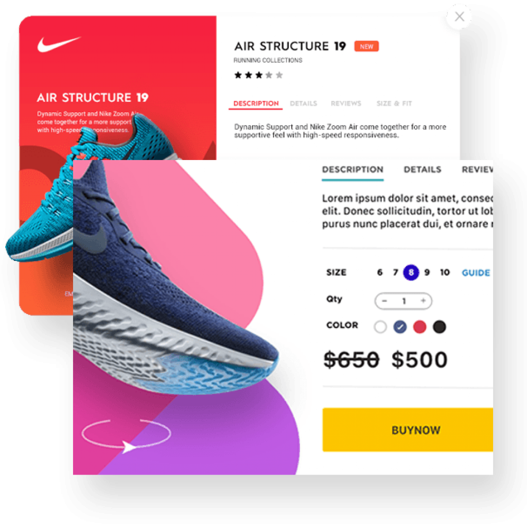
Modern

The modern design style changes every couple of years. Utilizing the latest stylish fonts, images, and website elements (sliders/banners/news letters).

Pros: Shows that your company is keeping up with the latest fashion.
Cons: Might look similar to other new websites.

modern-design
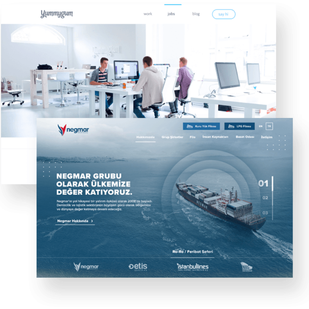
corporate-design

Corporate

This style is typical for B2B, financial lending companies, banks, dentist, lawyers and so on.

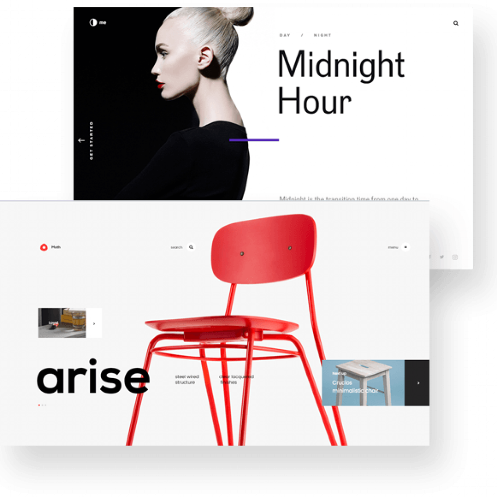
Minimalistic

Minimalism design style is characterized by fewer images, shapes, objects, banners, sliders and other object elements. Focuses on a clean, plain and simple design style.

Pros: Faster browsing loads, clear & concise.
Cons: Less creative, could be perceived as less-interesting.

minimalistic-design
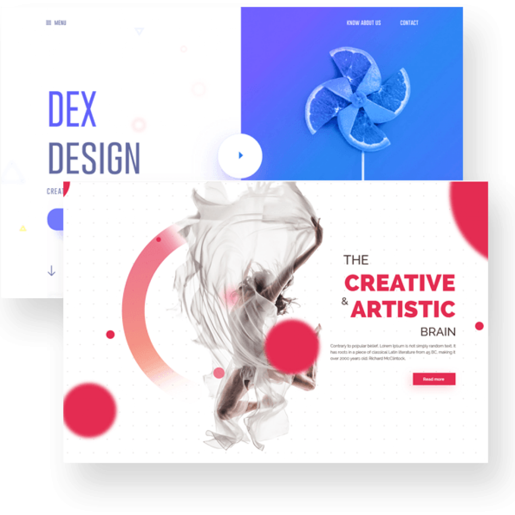
creative-design

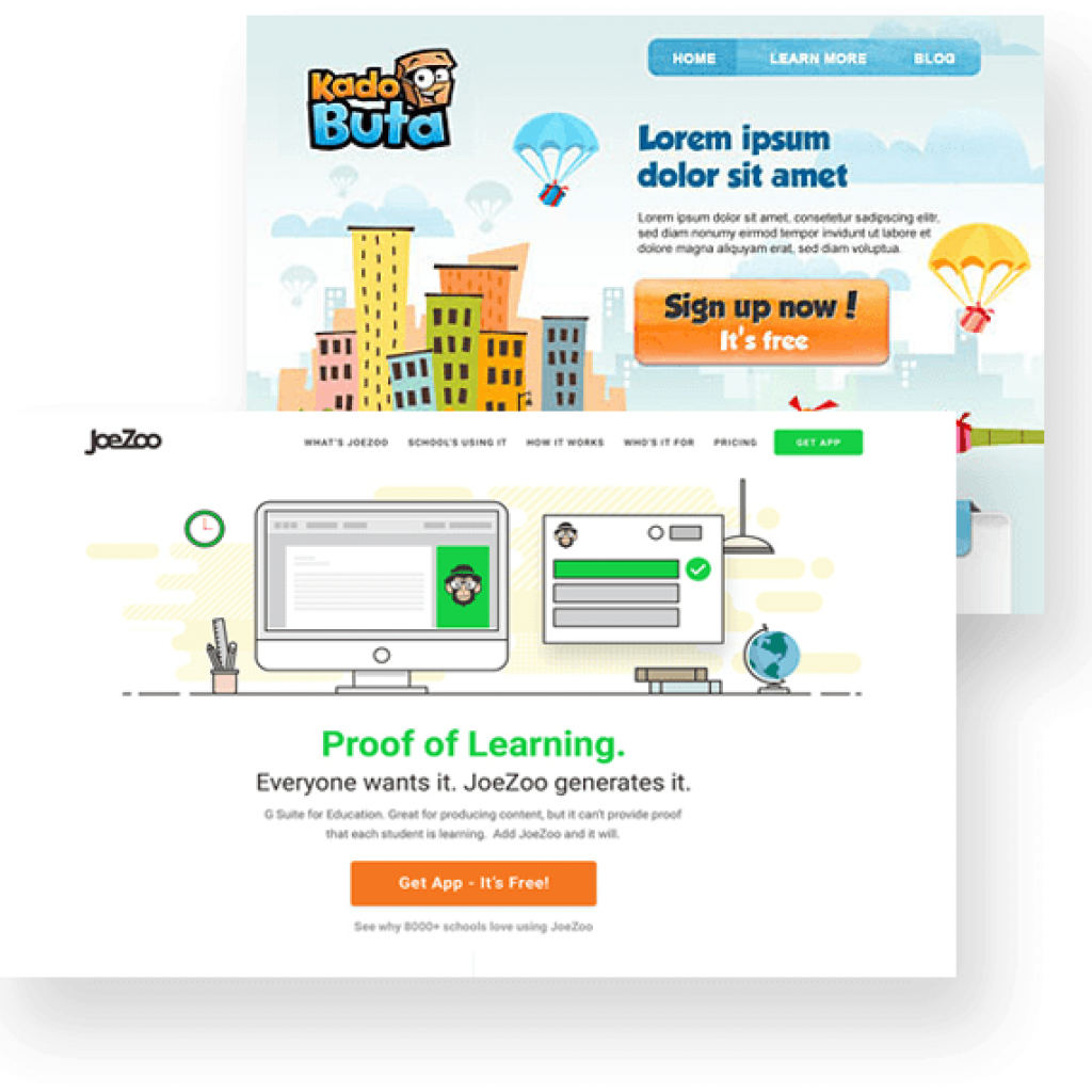
Creative

Creative design styles typically have more images, creative objects, animation, character. A larger focus on typography.

Pros: Fun, interesting, captivating.
Cons: Slower website loading times, can be confusing.

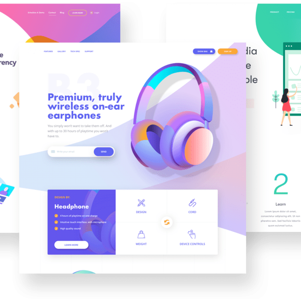
Illustrative

Illustrative usually involves drawing custom vector icons and images for the website/poster. This is favoured by photographers, graphic designers, landscaping companies and such.

Pros: Fun, interesting, captivating.
Cons: Slowing website loading times, can be confusing to navigate.
 
illustrative-design
futuristic-design

Futuristic

Futuristic design styles are subjective, however, the main focus is to give the feeling that you’re in the future while browsing the website, looking at the business card, logo or flyer.

Pros: Unique.
Cons: Not everyone’s favourite style.